
Designing a New Lesson Help Product Feature for DreamBox Learning Math
Design Problem: User feedback and data from educators and students revealed that they often did not know what they should do when first entering a lesson. The existing tutorial feature also required users to cycle through the entire list of built audio and in-lesson visual prompts when they wanted to understand a specific interaction.
I took the initiative to design a new lesson help feature for how to interact with the lesson “tools” and manipulatives and wore the Product Designer hat for this project, from UIUX, Visual and Motion Design System, and Development.
InVision App, XD, Animate/Flash, Photoshop
Video footage of final released Lesson Help product feature.
UIUX Design
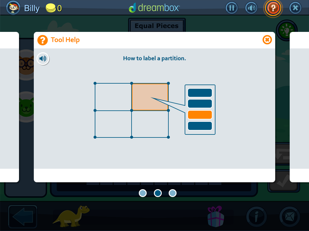
I proposed a design that provided users with animated clips showing lesson interaction features that would be presented as part of the first time user experience (FTUE). I created mid-fidelity and high-fidelity wireframes, provided storyboards, and created demo videos to demonstrate the general flow for the tutorial experience for the team and stakeholders.
Users would able to toggle between specific lesson interaction demonstrations that they wanted to view.
Users would also be able to swipe and/or click back or next between video clips and exit at any time either by tapping any where outside the help view or clicking on "x" in the help window.
(Post-release, I noted a future feature improvement for an added movie scrubber for users to choose how to control the video playback.)


Early proof of concept video demo of how the Help feature would function as part of the first-time-user-experience (FTUE).
Visual and Motion Design System
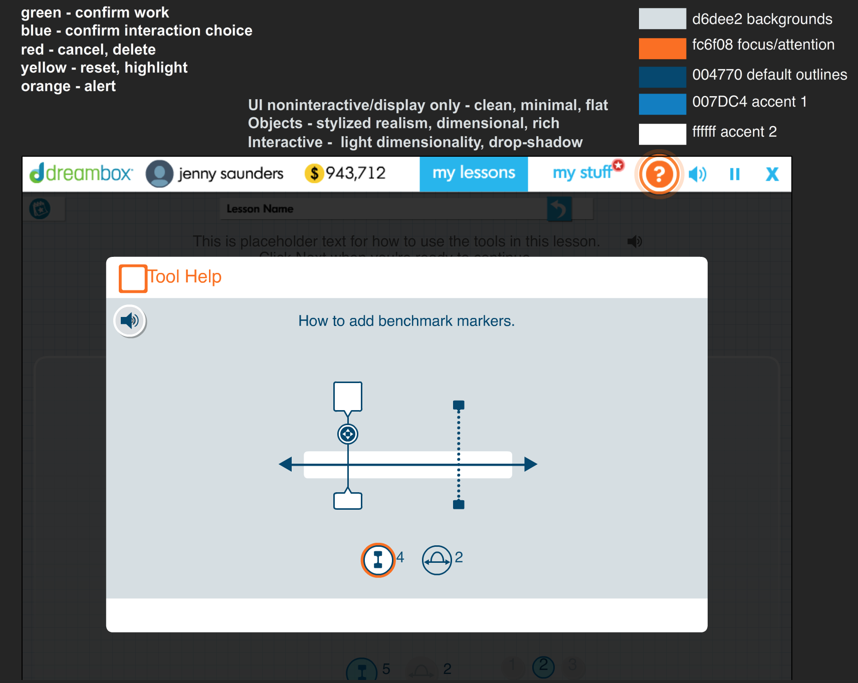
I focused on a visual style that would be neutral with a minimal palette that would be aesthetically pleasing and also have production scalability, consistency, flexibility, and be doable within technical, time, and resource constraints.
Simple line-based rendering to capture the essence of the “tool” and not be dependent on how the actual lesson tools are visually treated—in case the actual tools art style changes.
Blue color hues to echo blues used in the various student engagements. The dark blue chosen is also fairly neutral palette that could work for any newer engagements of engagement updates.
The oranges with its warmer contrast from the cool blue would be used specifically for areas of focus.
Animations would be minimalist and clean to present information clearly and focus on specific interactions.
Sample screen of working file with color choice process.
Demo high-fidelity animation to show how the final visuals and motions would appear.
Development—Release—Post-Release
I partnered with engineering first to investigate if the new Help Feature could be built within the existing engagement feature in time for new lesson releases.
We then validated the prototype within the product build in a test environment.
During development, I would work with artist creating the Help animations and assets and the scrum team on point for integrating and testing these feature components into the product build.
Post-release, I partnered with UX and Research in monitoring incoming student feedback and metrics that indicate improvements in the lesson user experience.
I also had the opportunity to present this feature at the company-wide Product Release monthly meeting.